
Simply Be Yourself
Challenge
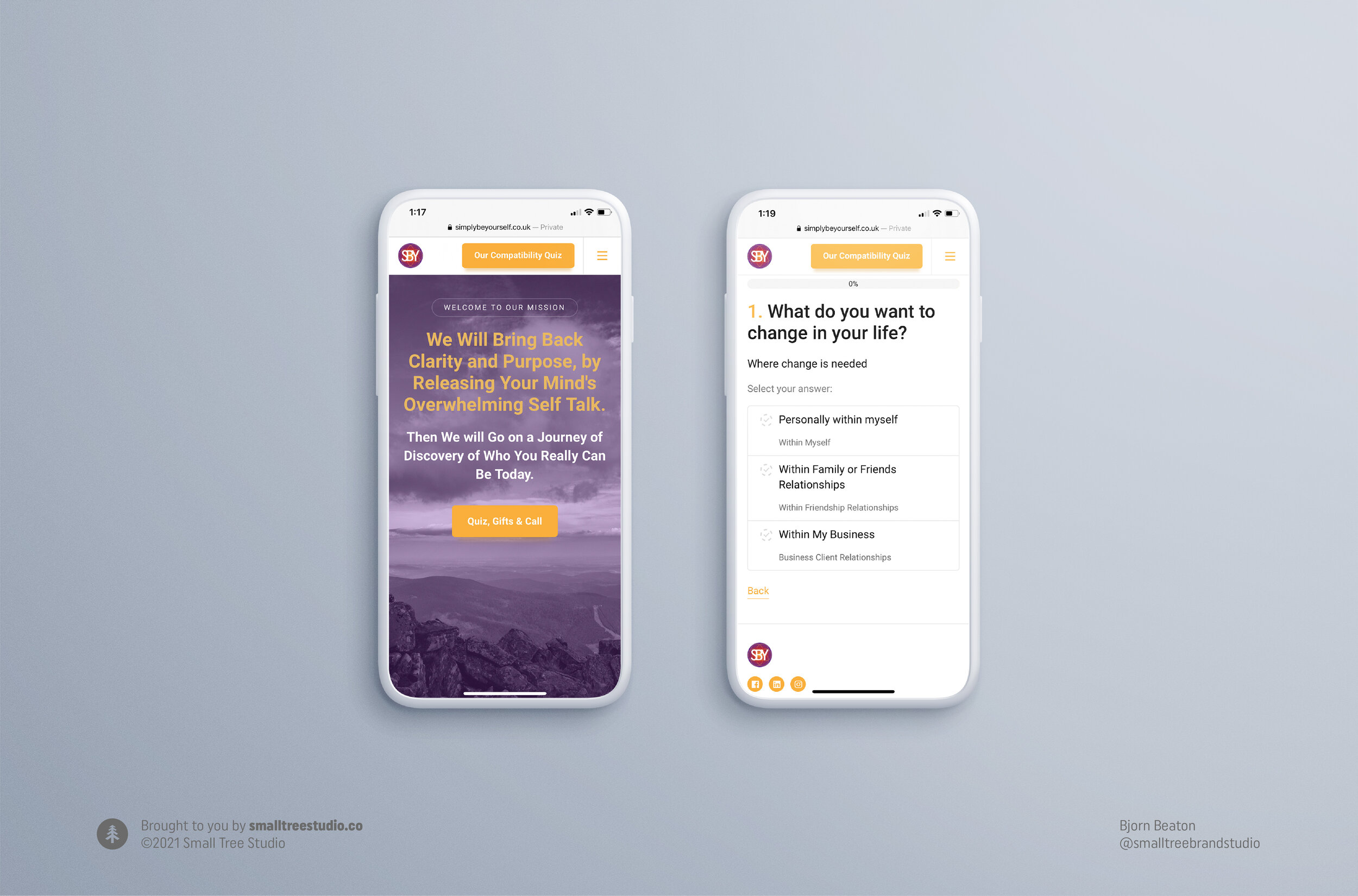
Simply Be Yourself is a mentorship program to clear the mind, body, and soul of negative energy. The UK based client is a nurturing guide that provides aspirational entrepreneurs with wisdom to grow their business and find peace within themselves. The client needed a clean, modern identity system for the new website that represents the health conscious customer and sacred geometry of eastern philosophy.
Solution
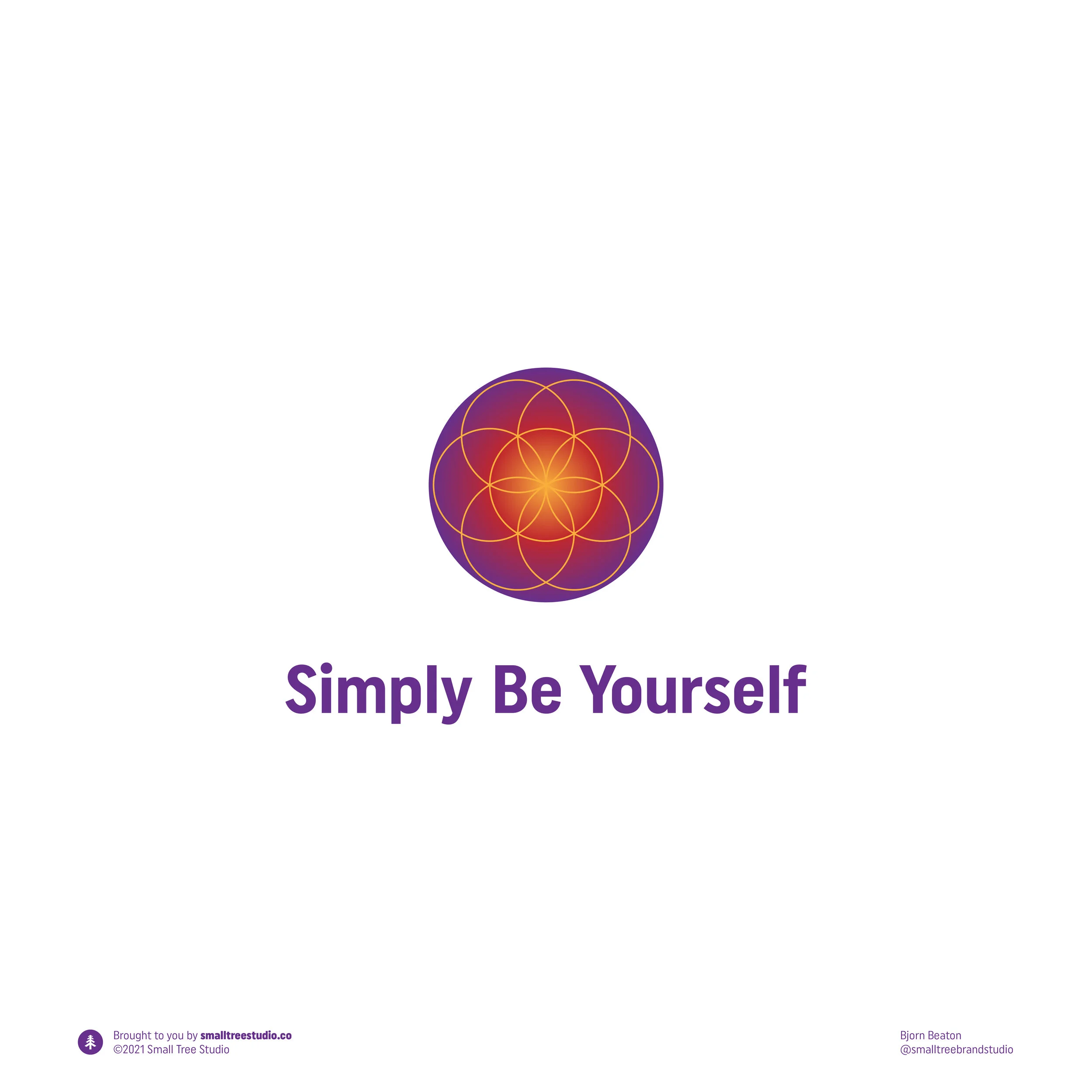
I integrated a bold design that symbolizes the seed of life, and chose colors that reflect life and passion. A approachable sans serif font was selected to express the client’s friendly and authentic business model. To symbolize the feeling of unity and simplicity, a lettermark was designed inside the symbol. I included a singular graphic icon for profile spots on various social media and the web, and a wordmark for use on print collateral.
Results
In the work I did for Simply Be Yourself, an ancient symbol representing life itself is combined with vibrant colors and clean typography for an amazing look and feel. The symbol conveys energized, warm, and dynamic vibes while the wordmark expresses authenticity, approachability and a sense of thoughtfulness. Together the two combine into a logo that evokes the feelings that the brand wants to convey: energy and wisdom. The project resulted in 25% more customer retention for the client, and increased brand awareness.


“The main benefit working with Bjorn was his intellectual design process. As this was very complex with all the different combinations of fonts, wording, and especially the complex colours in my design. But this is where you have the design genius blended with the kind but professional services Bjorn seems to deliver effortlessly.
So of course I would recommend Bjorn to others, as the resulting work is so high level. You simply will not believe what is achievable until you see your creation in progress, and then the final designs to come which are so expertly delivered. You simply will not be disappointed in your investment of time and money into his excellent craftsmanship”
–Richard Davies