
Silver Age Cinema
Challenge
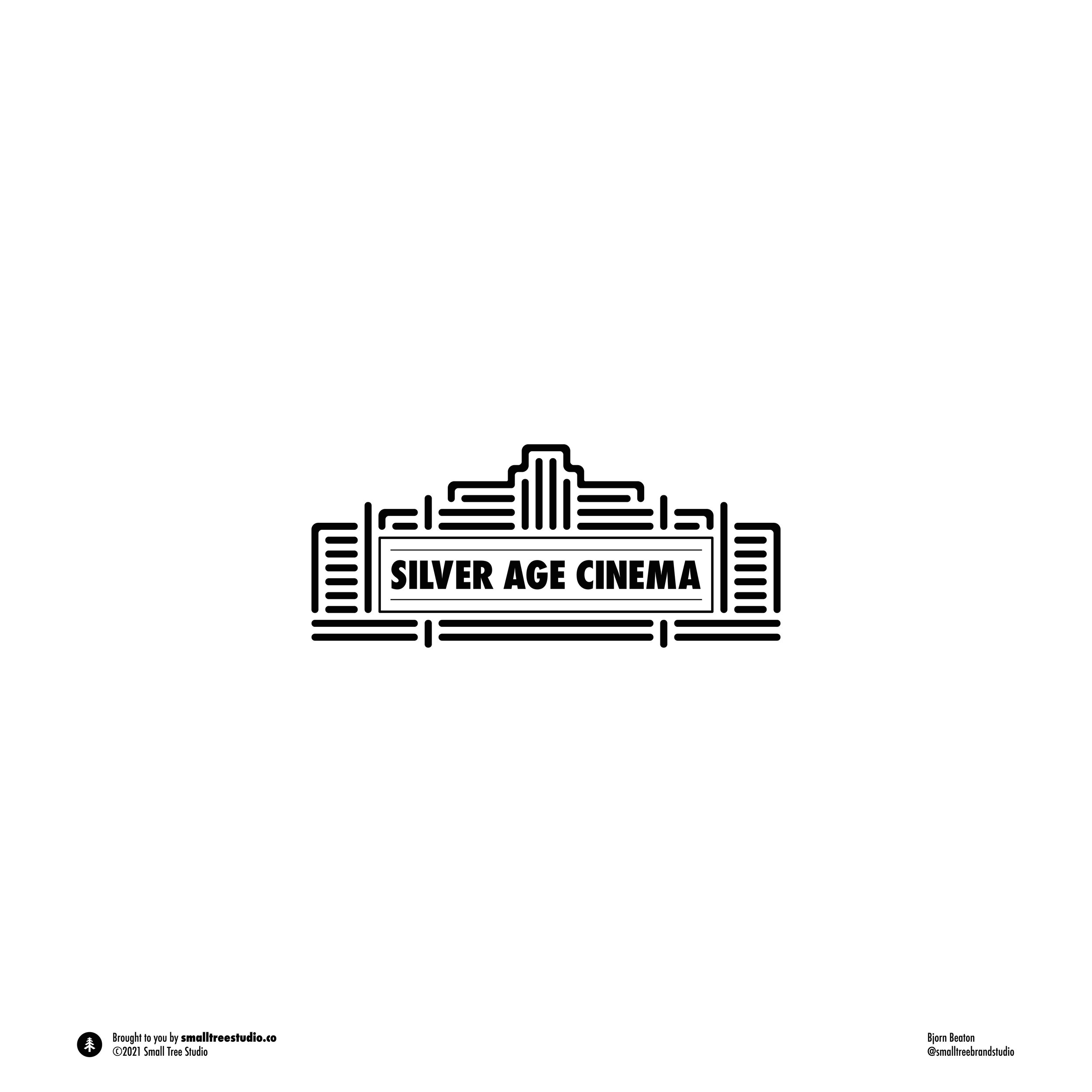
The Silver Age Cinema identity project was created for a classic movie review channel on YouTube. A fresh take on older films, with a witty approach. The client needed an identity system for the new channel that represents the family aspect and heritage of movie marquees in the past. Additionally, logo variations for print were needed for merchandise at a later date.
Solution
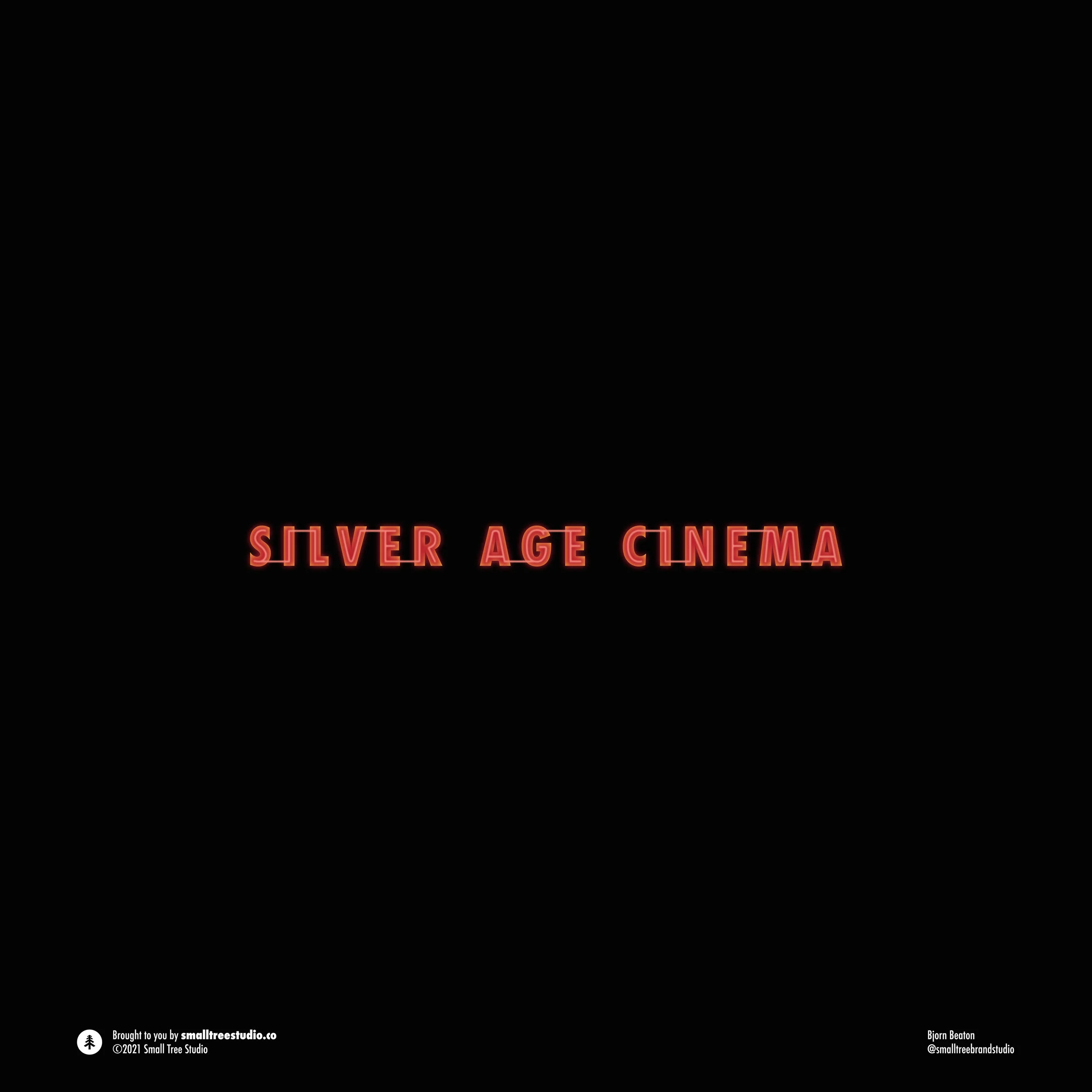
I worked with a bold color palette that evoked the cinema experience and neon lights of the city. A timeless sans serif font was chosen to express the heritage of classic films. To symbolize the feeling of dynamic and classic minimalism, a wordmark was designed inside a stylized neon marquee for print and web. I included a lettermark for circular profile spots on various social media, and a glowing wordmark for use on YouTube homepage banners.
Results
In the work we did for Silver Age Cinema, one can clearly see how a minimal symbol representing the simple joys of the past can be combined with bold typography for effective brand awareness. The marquee symbol conveys bright, dynamic, big city vibes while the wordmark expresses authenticity, approachability, and a sense of timelessness. Together the two combine into a logo that evokes the feelings that the brand wants to convey: heritage and sincerity. The project provided the client with increased brand recognition across social media, and the classic visual identity they desired.


“A huge thank you to Bjorn Beaton for helping us develop our logo. As a brand new YouTube channel, we knew how important it was for our logo to pop and boy does it. We appreciated your prompt responses and many suggestions in creating our perfect brand. We highly recommend your services, not only did you design a logo we love but you were very encouraging and uplifting as well. Thank you from Silver Age Cinema.”
—Steve Logan