Faction Cannabis
Welcome to the conceptual journey behind Faction Cannabis' brand identity project – a visual and immersive representation of the seamless and comprehensive approach this Washington state-based cannabis company undertakes from farm to market. My design philosophy aims to encapsulate the essence of Faction Cannabis by highlighting its commitment to cultivating, extracting, packaging, and selling premium cannabis products all within a single, integrated location. This unique approach ensures quality at an affordable price, setting Faction Cannabis apart as a leader in the industry.
Key Themes:
Integration and Unity—The core of Faction Cannabis lies in its ability to oversee the entire process, from cultivation to sales, under one roof. The design concept reflects this unity by seamlessly connecting different aspects of the brand's journey through consistent visual elements, colors, and typography. This approach not only portrays efficiency but also communicates a sense of trust and transparency.
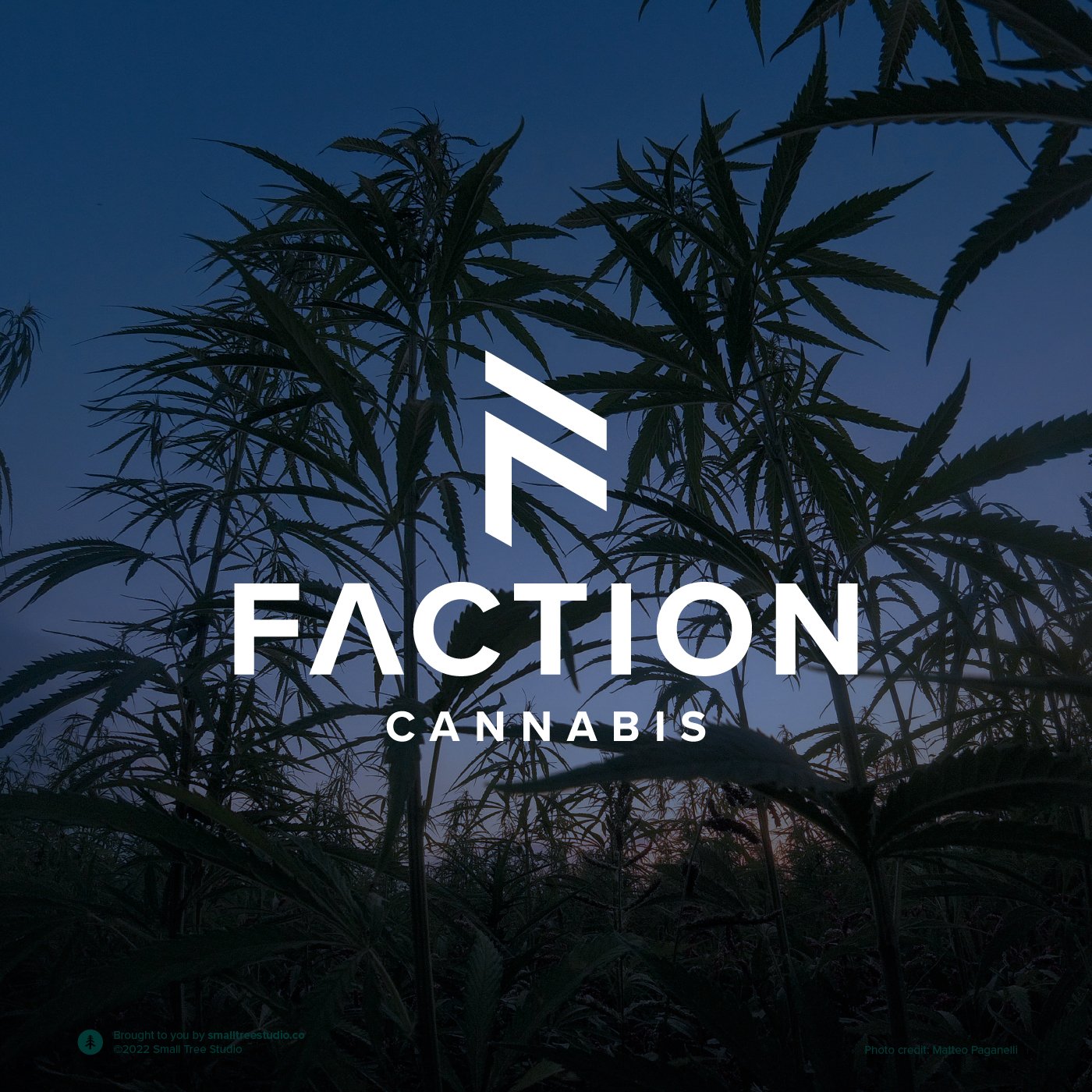
Quality and Craftsmanship—The brand identity is crafted to evoke the notion of artisanal care and dedication that Faction Cannabis puts into each step of its process. Earthy, organic textures and natural color palettes echo the farm-to-table ethos, emphasizing the hands-on approach to cultivation and extraction.
Affordability and Accessibility—While quality is a priority, affordability and accessibility are equally vital to Faction Cannabis. The design language emphasizes these values through clean and straightforward design elements. Clear typography and well-structured layouts convey the brand's commitment to providing a top-notch experience without exclusivity.
Visual Elements:
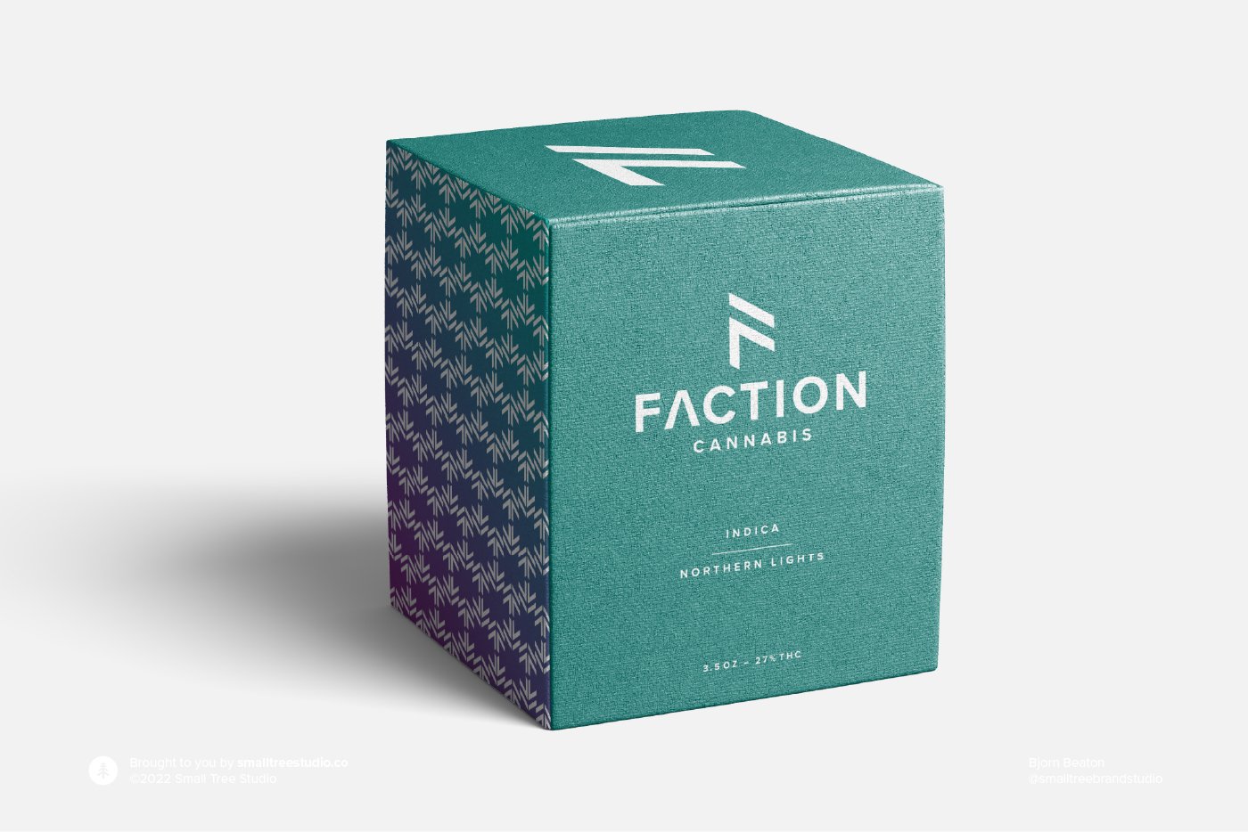
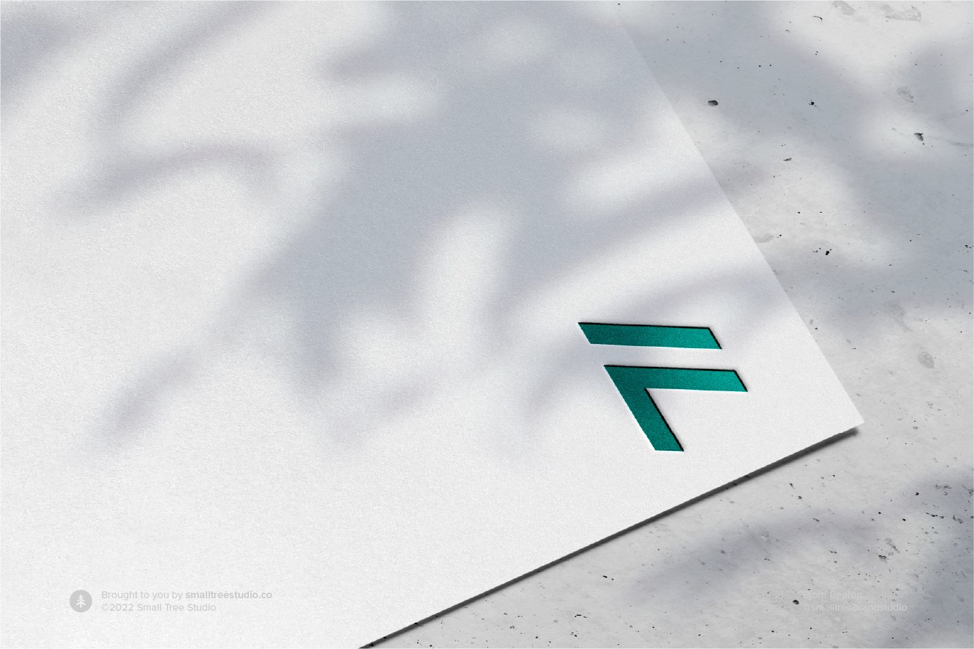
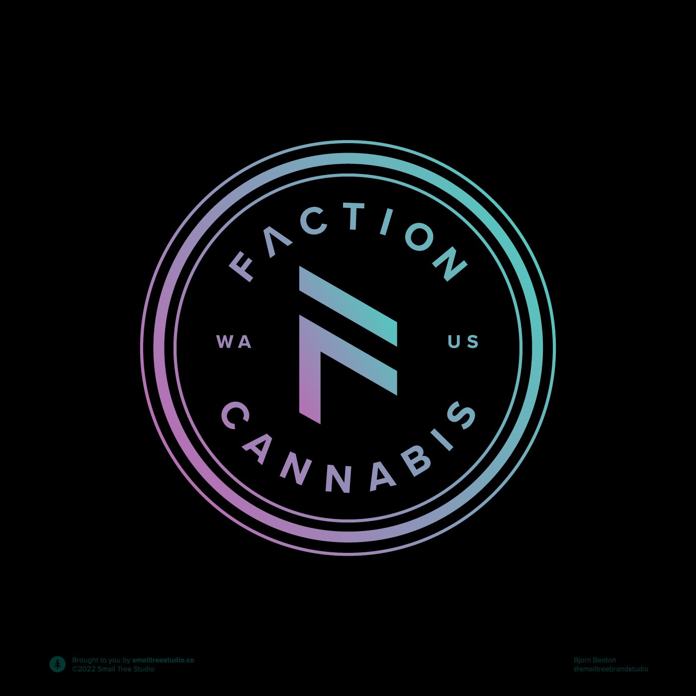
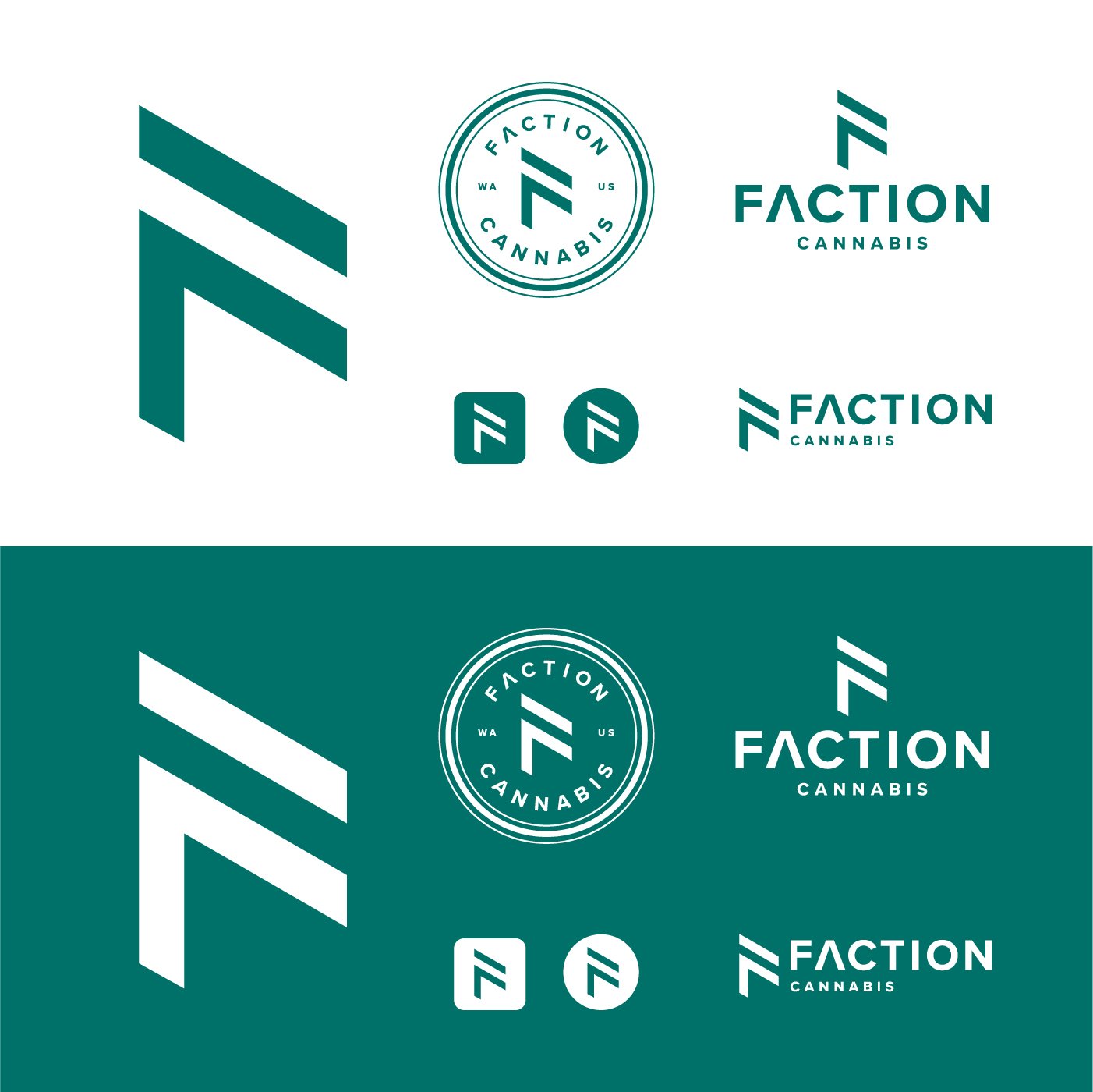
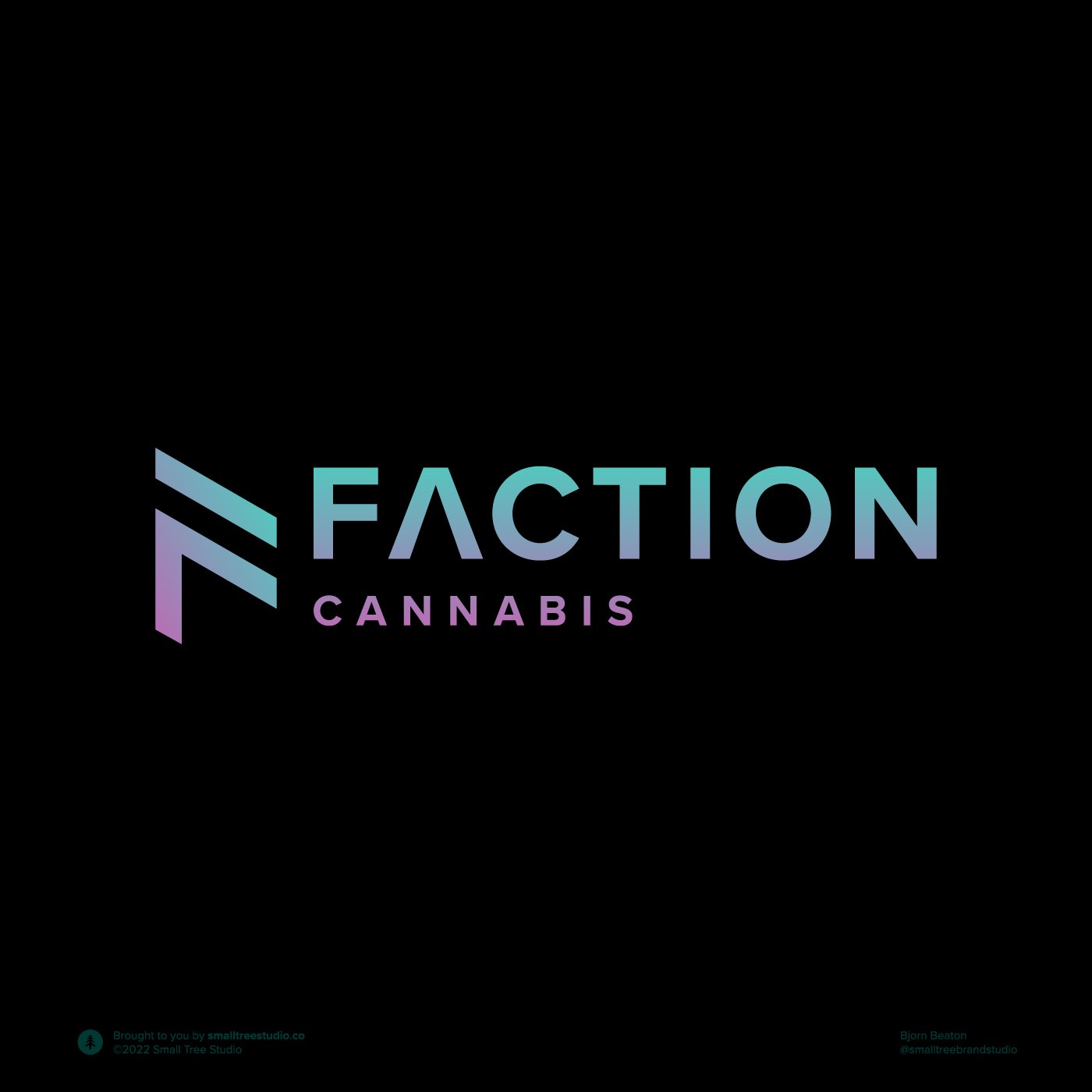
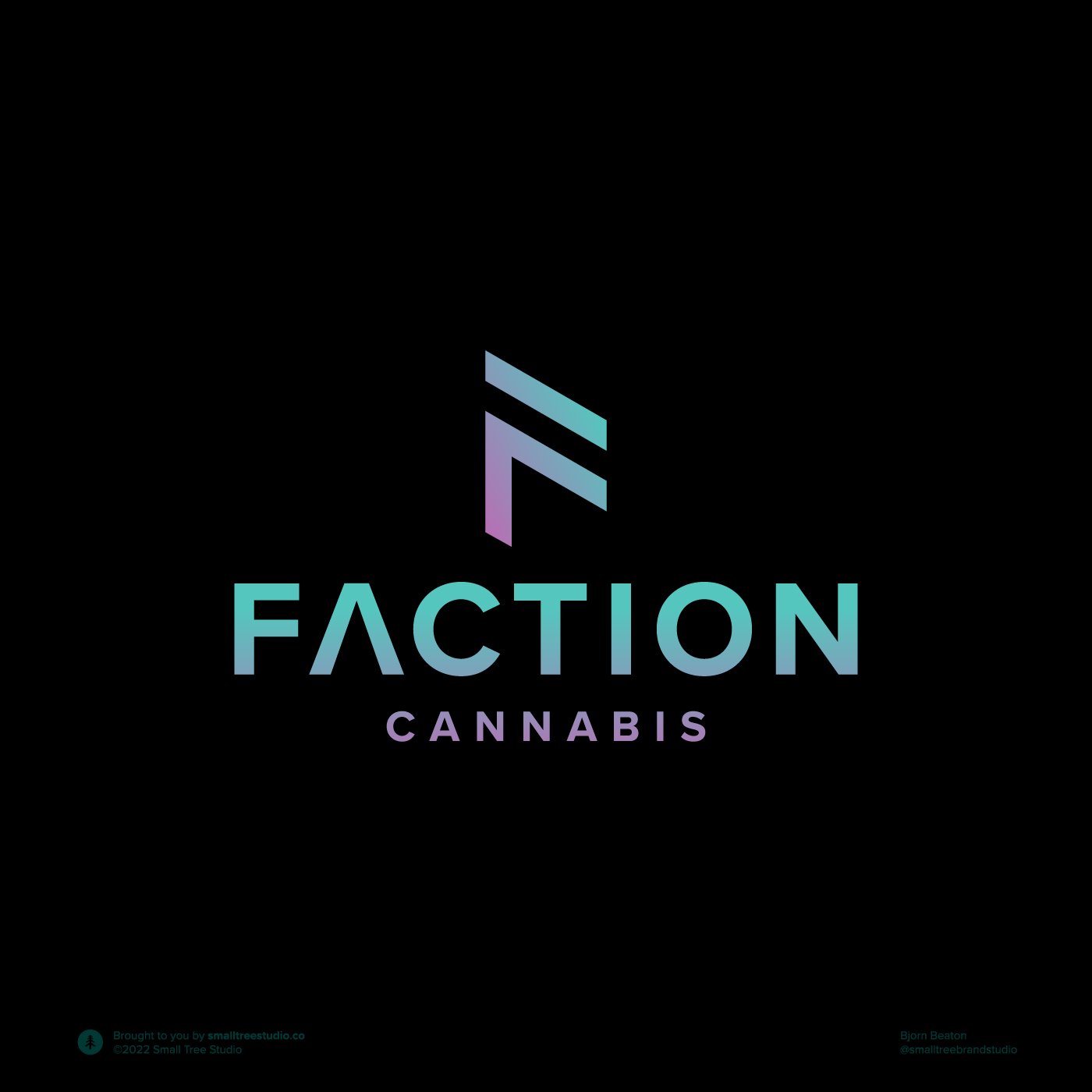
Logo—The Faction Cannabis logo embodies innovation and distinction through a stylized letterform morphing from a stack into a letter mark, symbolizing integration.
Color Palette—Vivid green and magenta of the northern lights underline the authentic and organic nature of the brand's products. These colors create an inviting and etherial atmosphere that resonates with the brand's unique approach.
Typography & Collateral—The typography is bold yet approachable, mirroring Faction Cannabis' dedication to transparency and accessibility. Collateral materials such as product labels, brochures, and digital assets resonate with the visual elements of the brand, offering a cohesive and immersive experience.
Faction Cannabis' brand identity concept is more than just visuals; it encapsulates the values, commitment, and journey that make the brand unique. From cultivation to market, the design language ensures a cohesive narrative that builds trust, conveys quality, and demonstrates affordability. This comprehensive approach truly sets Faction Cannabis apart in the Washington state cannabis landscape, positioning it as a destination for consumers seeking both premium products and an authentic experience.