Azimuth Environmental
In an industry where environmental preservation and technological innovation intersect, Azimuth Environmental stands as a beacon of expertise and responsibility. As a collective of graduate students and teachers specializing in drone surveying, they required a brand identity that would capture the essence of their unique mission. This case study delves into the challenges faced, the innovative solutions employed, and the remarkable results achieved in crafting their brand identity.
Challenges:
Azimuth Environmental, an environmental consultancy in Washington, approached me with a unique challenge. They needed a brand identity that would reflect their specialization in drone surveying, their commitment to environmental preservation, and resonate with their peers and clients. The task was to create an identity that was professional yet approachable, technical yet environmentally conscious.
Solution:
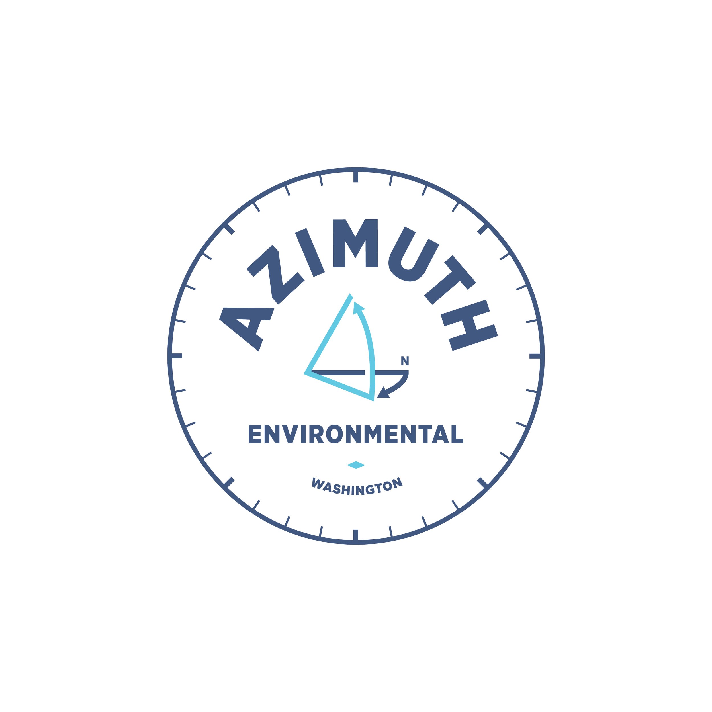
Logo Design—The heart of this brand identity project lay in creating a logo that encapsulated the essence of Azimuth Environmental. To tackle this challenge, I took a technical perspective, drawing inspiration from the world of drone surveying and global navigation.
The logo mark features a geo-spatial azimuth icon, which not only symbolizes the technical aspect of their work but also conveys a sense of precision and direction. The use of clean, modern lines and geometric shapes ensures the logo's versatility and scalability.
Typography—For the logo’s font, I chose a modern sans-serif font. This choice reinforces the brand's commitment to innovation and technology while maintaining a clean and professional look. The font's simplicity also makes it easy to read and adapt across various applications.
Color Palette—The color palette was a crucial aspect of this project. I selected two shades of blue, drawing inspiration from both the sky and water. This choice not only reflects the environmental aspect of their work but also evokes a sense of trust, stability, and reliability.
Results:
The brand identity for Azimuth Environmental has successfully addressed the challenges presented in the brief. The responsive logo marks, with their technical and environmental symbolism, represent the core of the company's work. The use of a modern sans-serif font ensures clarity and readability in various contexts, from digital platforms to printed materials. The blue color palette provides a sense of trustworthiness and reflects the brand's environmental consciousness.
Overall, the new brand identity positions Azimuth Environmental as a forward-thinking consultancy that blends technical expertise with environmental responsibility. It speaks to their mission to explore and protect the environment, all while maintaining a professional and approachable image. The project has been a resounding success, and I am proud to have helped Azimuth Environmental establish a strong and memorable brand identity.